iOS · Coming soon
A little nudge to actually take my meds.
An iPhone app for staying on track with medication. Timely reminders, a photo check-in before confirming a dose, and a history of taken and missed doses.
I kept forgetting to take my medication. Sometimes I was late. Often I missed it altogether. I needed something that would make me pause and follow through. So I started building aizu for myself, and for anyone else who needs that little nudge.
Explore aizuThe app today
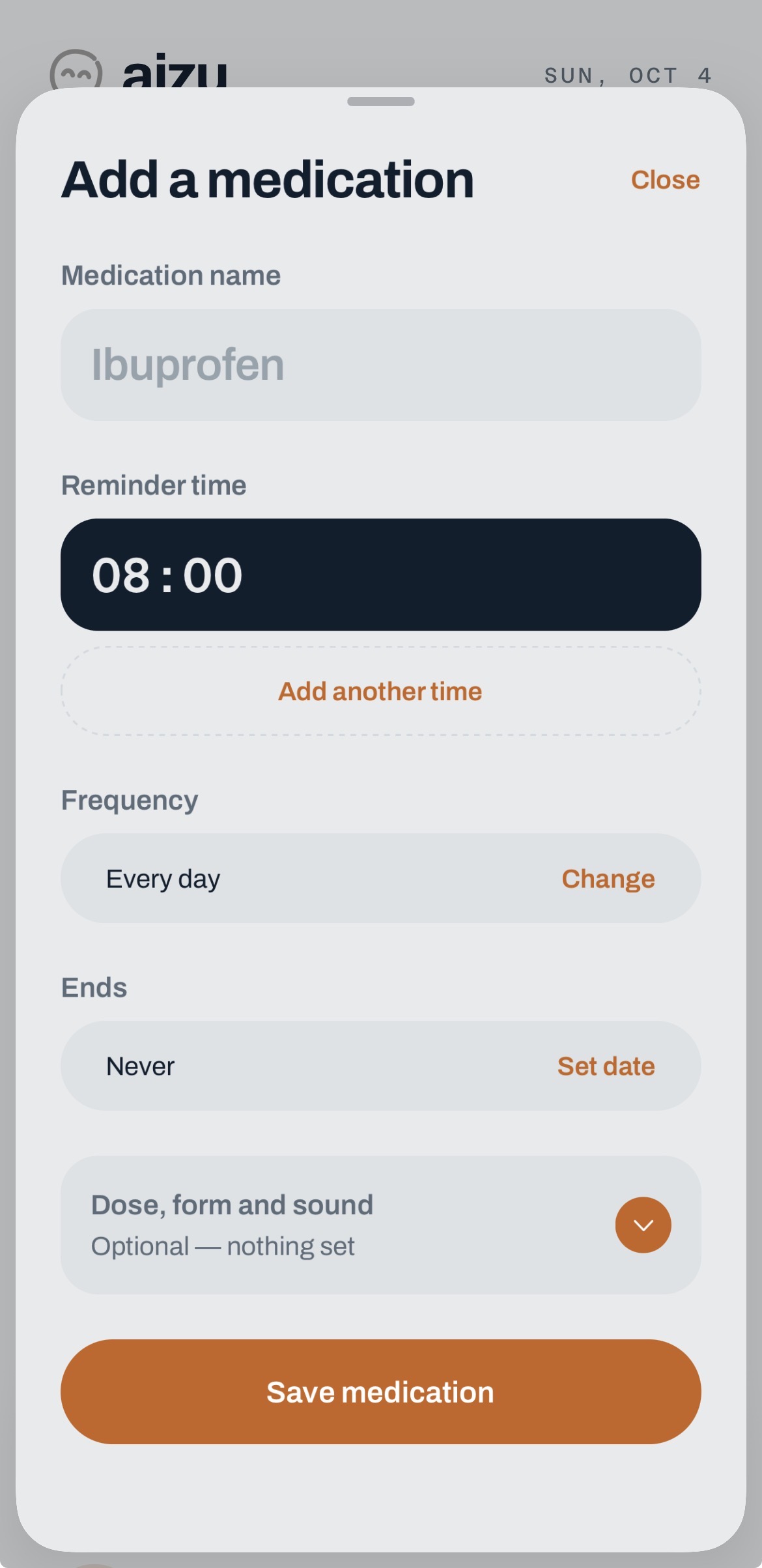
The next dose comes first. A timeline puts it in the context of the day, with the medication list underneath. Adding a medication brings the reminder times and frequency into one sheet.
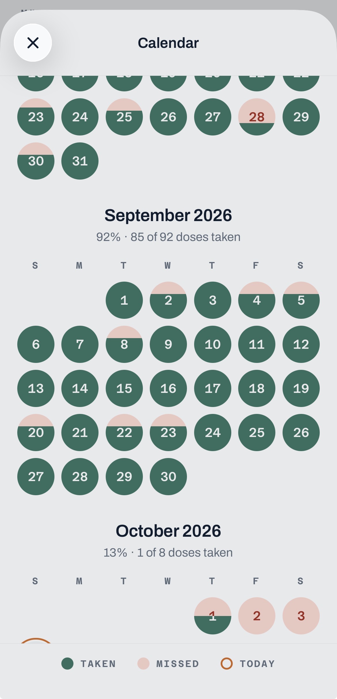
The calendar gives the history a different scale. Taken and missed doses fill each day, so it’s possible to look back across a whole month.
Case study
I’m designing and building aizu as I go. Here’s how the reminder flow, the first screens, and the app’s identity took shape.
The extra step is the idea
An alarm can get my attention. Getting the pill in front of me is what turns that attention into an action. In aizu, the reminder leads to a camera check-in, then I confirm the dose. The alarm stops and the dose goes into my history.
The camera checks for a pill-like shape on the phone. There’s also a way to log a dose without a photo, and a simple Taken button for medicines that aren’t pills. Snoozing and marking a dose as not taken leave room for the days that don’t go to plan.
Finding the first shape
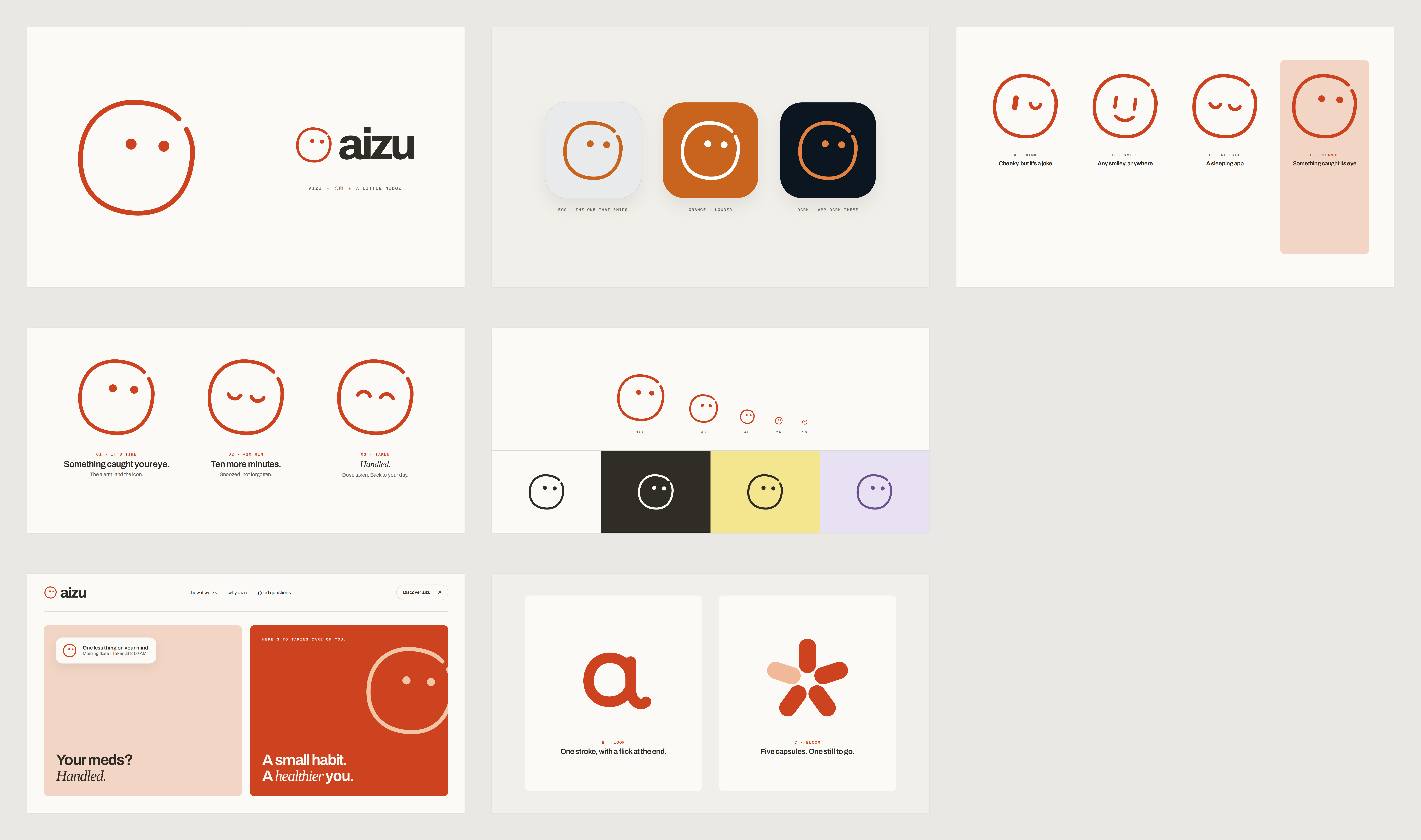
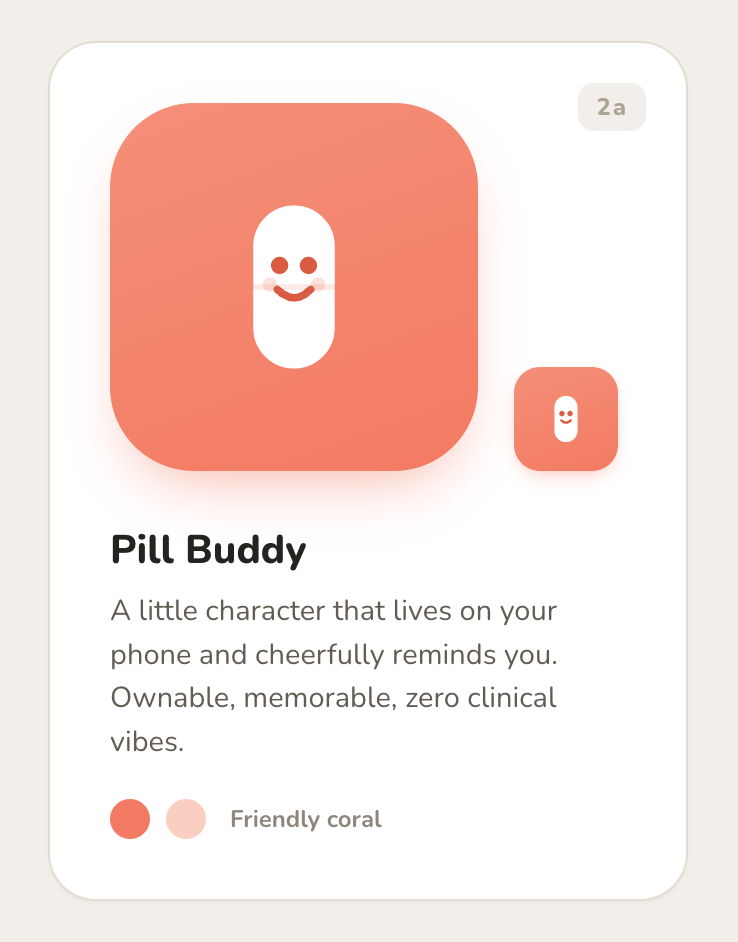
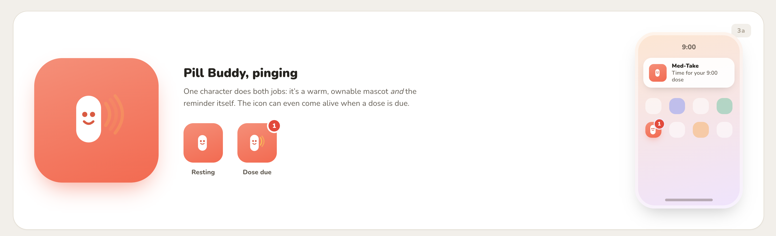
The early explorations were quite literal. A smiling capsule, called Pill Buddy, put the medication itself at the centre of the identity. Another version added a signal beside it when a dose was due.
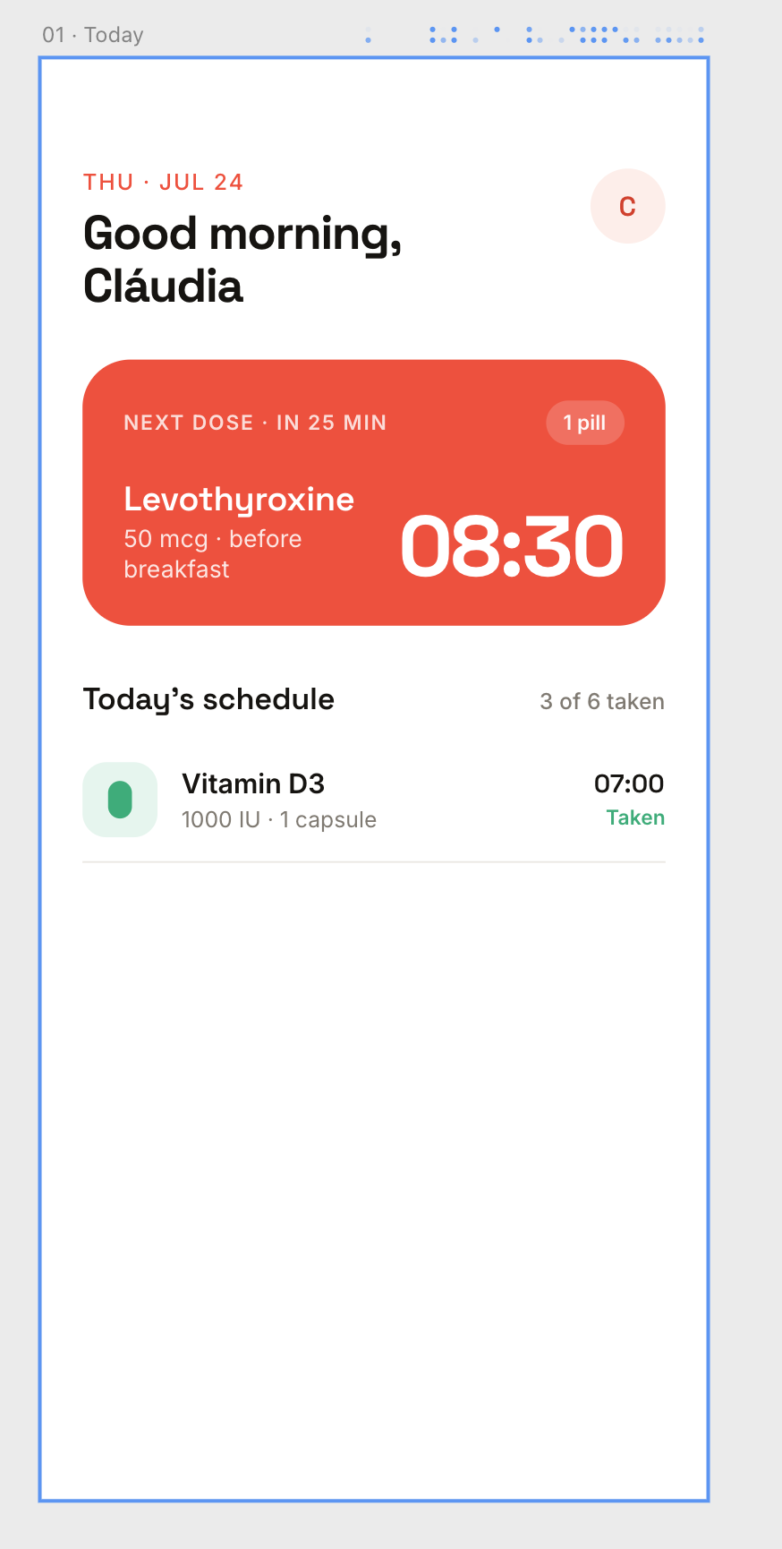
The first Today screen brought the same warm colour into the interface. The next dose took up the most space, with its time and medication together. The rest of the day’s schedule sat underneath. It was an early way of working out what needed attention first.
A name for the reminder
I was reading Haruki Murakami and thinking about Japan’s respect for time. That led me to aizu, meaning ‘signal’ in Japanese. It felt right for a little reminder that arrives when you need it.
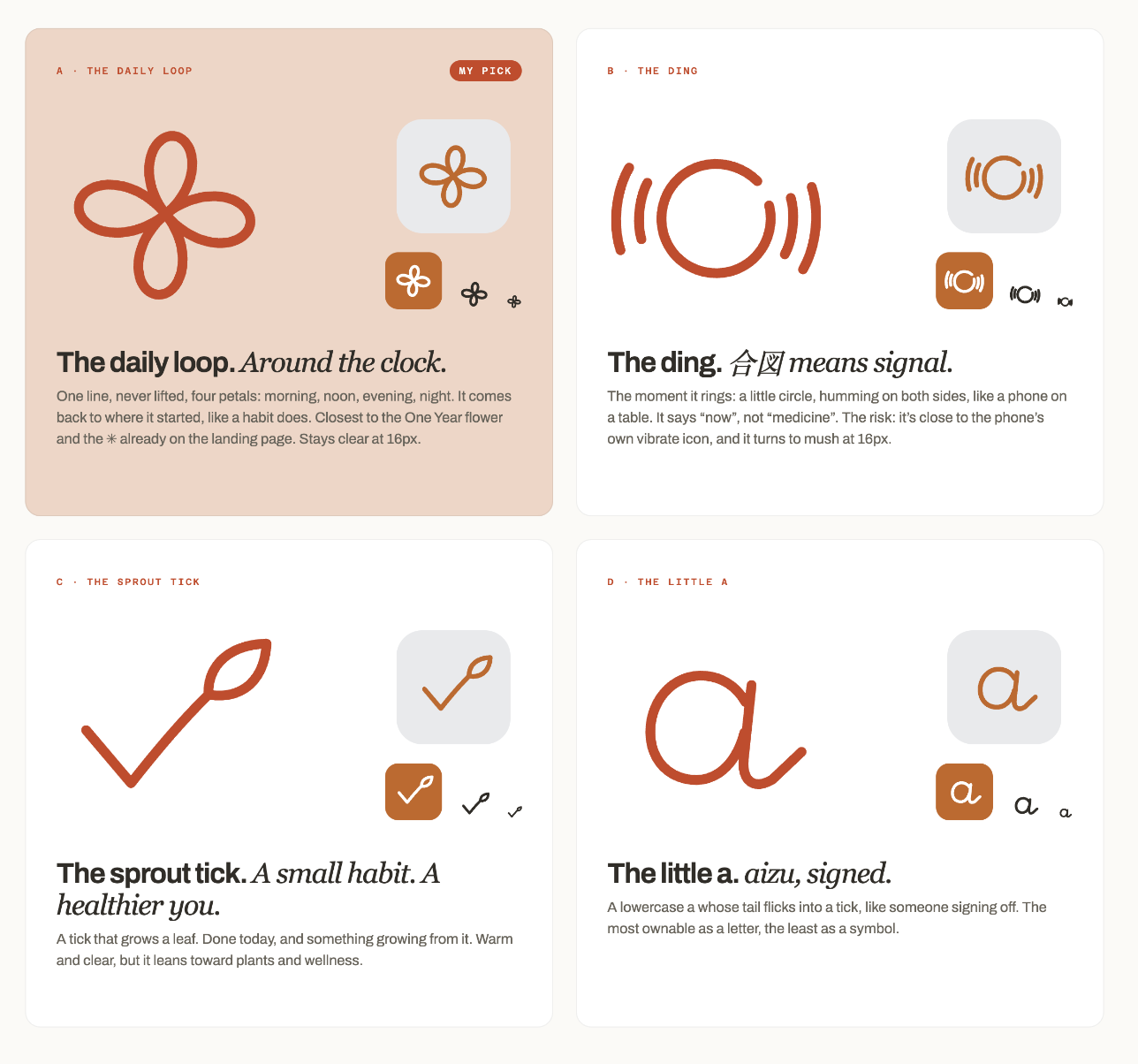
The logo exploration opened up from there. A looping flower suggested a daily routine. A ringing circle made the signal literal. A sprouting tick connected taking a dose with a small habit, while a handwritten ‘a’ explored a more personal signature.
A face that says it’s handled
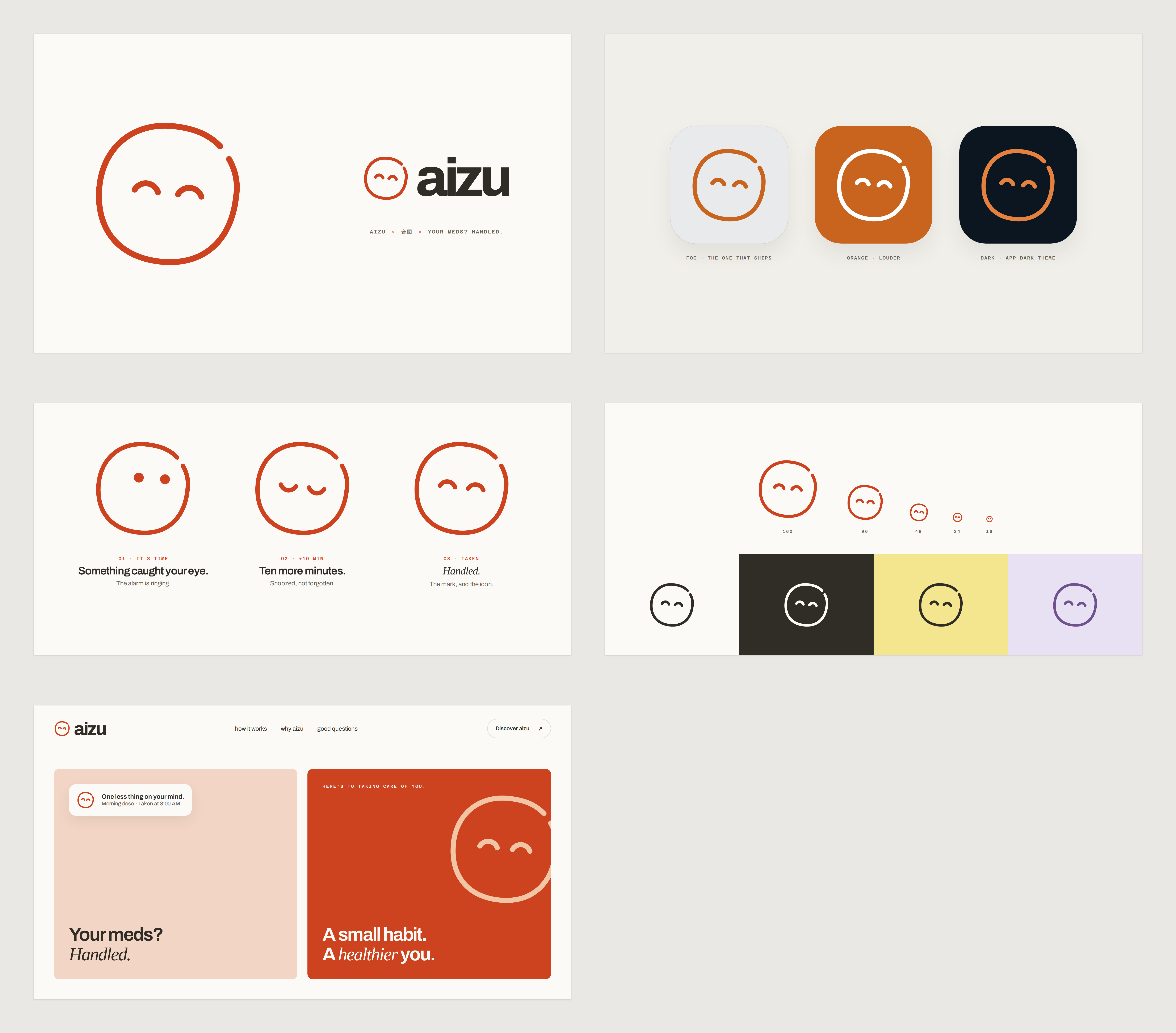
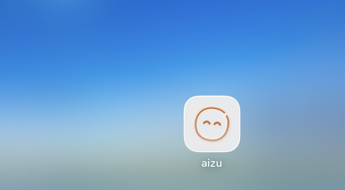
The face studies explored how much expression could fit into a simple open circle. The glance felt alert. Closed eyes suggested a snooze. The upward curves became the ‘handled’ expression, the one now on the app icon.
The boards put the mark beside the wordmark, on light and dark backgrounds, and at sizes down to 16 pixels. They also tried different expressions for a reminder, a snooze, and a completed dose. The same small face could follow the rhythm of the app.